
Charthop Better UX
by ajatamayo5.0
1 reviews
9
users
Published
February 27, 2023
Screenshots

Description
Charthop.com is a webtool to manage a company's people data in one place, including employee evaluations. The problem is, the default layout of Charthop is hard to use UX-wise.
This chrome extension helps with that by injecting custom CSS to the corresponding pages.
Here's a list of the changes:
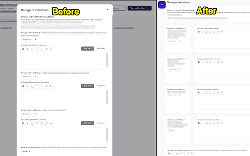
Manager Evals Popup
- The popup now takes the whole screen.
- Your report's icon is displayed on the upper left corner to show who you're evaluating.
- The form is arranged into more sensible groups, not just one column.
Self Evals, Colleague Evals Results
- Removed empty containers.
- Arranged into a 2-column grid.
- Images can be clicked to zoom, but know that if it's a low res image, it'll just be pixelated.
- Fixed pre element breaking the grid.
- Grouped each Q&A into a card for better readability.
See the attached screenshots to see the changes. Note that sensitive information will be redacted.
Add to Chrome
Quick Info
- Version
- 1.0.2
- Size
- 13.88KiB
- Price
- Free
- Type
- Extension
Categories
Languages
English (United States)